Reproducible grain recipe
Muted Color-Negative Landscape
A soft 3px color-grain recipe that gives detailed terrain and an overcast sky a restrained color-negative character.
Published · Original source retained · Fixed seed
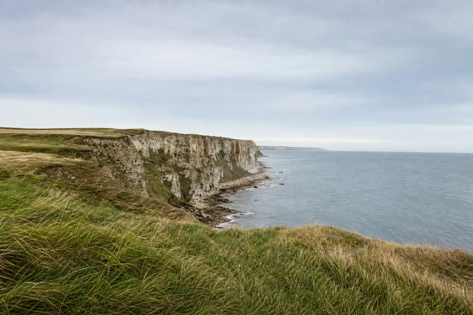
Original
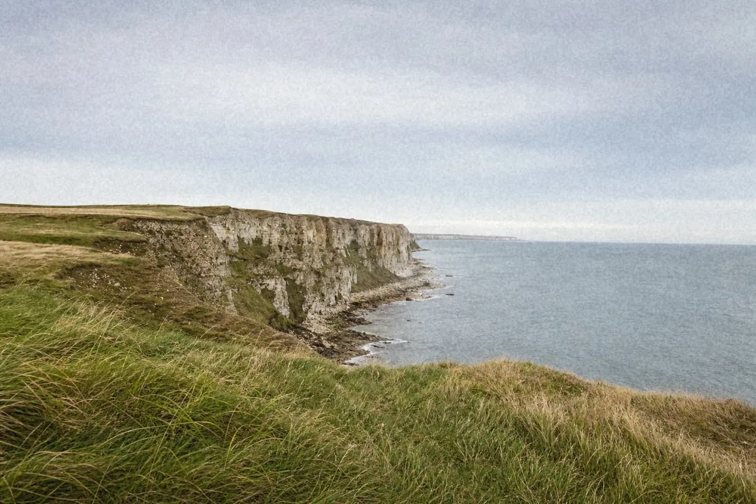
Processed with imagegrain
Why These Settings Work
Fine grain at 38% adds enough texture to connect detailed grass with the smooth sky, while 45% softness stops the pattern from reading as sharp digital noise. The modest 12% color component introduces chroma variation without scattering obvious red, green, and blue pixels through the clouds.
Highlights are reduced to 55% so the pale sky stays calm, while shadow and midtone texture gives the land more physical presence. A 20% fade and 15% warmth mute the digital contrast and coolness; the light vignette is just strong enough to keep attention inside the frame.
Exact Settings
- Intensity
- 38%
- Type
- fine
- Size
- 3px
- Roughness
- 8%
- Softness
- 45%
- Color grain
- 12%
- Shadows
- 75%
- Midtones
- 100%
- Highlights
- 55%
- Fade
- 20%
- Warmth
- 15%
- Vignette
- 10%
- Color mode
- Color
- Seed
- 350377
Best For
- Overcast landscapes
- Travel photographs with detailed terrain
- Muted editorial color palettes
When to Avoid It
The scene depends on very clean blue skies or highly saturated product colors. Color grain and warmth can make those areas look dirty or shift colors away from an accurate rendering.
Resolution and Export
The shown 1536×1024 result uses a 3px grain size. Try 2px for smaller social images and 4–5px for larger exports, always comparing at the final display size as well as 100%.
WebP at roughly 82–88 quality is a strong default. Inspect the sky for banding and colored compression artifacts; raise quality or reduce color grain if they appear.
Reproducibility Note
The original photograph is retained with the project. The processed result uses the same deterministic browser renderer as the editor and seed 350377, allowing an exact rerender.
Review the complete methodology →